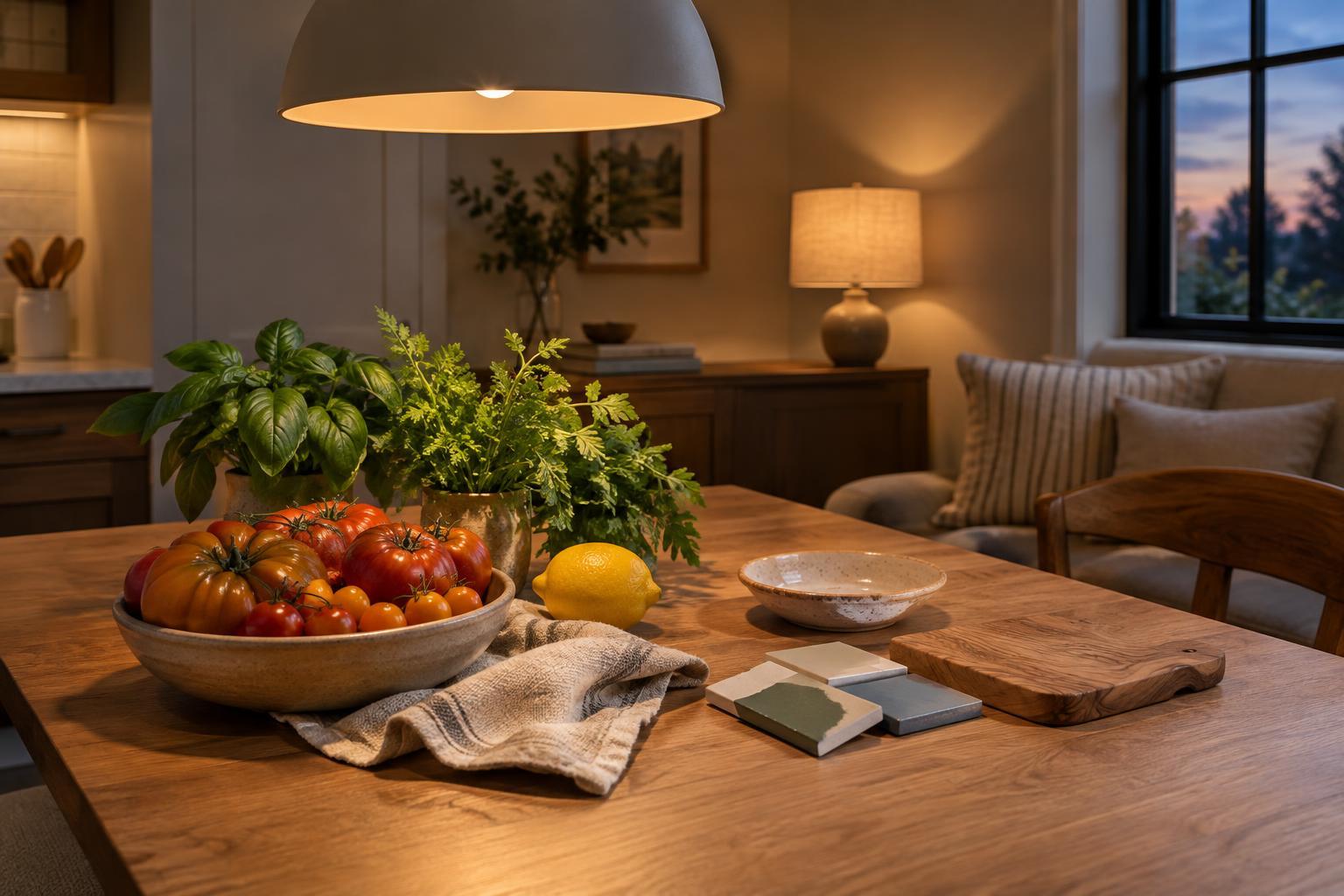
What color rendering changes in a room
Color rendering describes how light reveals the colors of objects. Two bulbs can appear equally bright and have the same warm or cool tone, yet make a sofa, a bowl of fruit or a painted wall look different. One may show subtle differences between colors clearly; another may make them seem muted or shift their appearance. This matters when a room contains finishes you chose to work together.
Color rendering is not the same as color temperature. Color temperature describes whether a bulb’s light looks warmer and more golden or cooler and more bluish. Brightness describes how much light it produces. You need to consider all three: a bulb with good color rendering can still feel uncomfortable if it is too bright, too dim or the wrong tone for the space.
How to read the label without relying on one number
Many bulb packages list a Color Rendering Index, or CRI, on a scale that runs up to 100. A higher CRI generally suggests that colors will look more natural under that light compared with a lower-CRI alternative. For everyday home use, a bulb labeled CRI 80 may be adequate, while CRI 90 or higher can be worth considering where color distinctions matter. The number is a useful starting point, not a guarantee that every color will look exactly as you expect.
CRI is an average based on a set of test colors. It does not fully describe how a particular bulb handles every saturated color. If a product lists an R9 value, that figure offers an additional clue about how it renders a strong red. R9 may be helpful when comparing lights for food, warm-colored textiles or skin tones, but it is not printed on every package. If two bulbs have similar specifications, seeing them illuminate real objects can be more informative than choosing by a single number.
Put better color where you will notice it
In a kitchen, light with good color rendering helps you see ingredients and prepared food more clearly. Under-cabinet lighting can be especially useful because it falls directly on the work surface rather than leaving it in your shadow. In a bathroom, light beside or around a mirror can reveal skin tones more evenly than a single fixture high overhead. Color quality matters in both places, but so does fixture position.
Living rooms and bedrooms benefit in quieter ways. Better color rendering can help a wood finish retain its character, keep a patterned rug from looking flat and make artwork easier to appreciate. You do not need to replace every bulb at once. Start with the lamps or fixtures that illuminate faces, work surfaces and the objects that define the room. A utility cupboard may need dependable visibility more than especially nuanced color.
Test bulbs against your actual finishes
Paint chips, fabric samples and flooring can change appearance between a store and your home. Before buying several matching bulbs, try one in the fixture where you plan to use it. Look at the room in the evening, when the bulb has more influence than daylight. Check a few familiar objects, such as a white towel, a piece of wood and a colorful cushion. If colors look muddy or oddly tinted, compare another bulb with a similar brightness and color temperature so that color rendering is easier to judge.
Also look for consistency across fixtures that light the same area. A kitchen counter lit by noticeably different bulbs may appear patchy even if each bulb works well on its own. Matching color temperature and choosing bulbs with similar color-rendering specifications can help the room feel more coherent. For dimmable fixtures, check that the bulb is compatible with the dimmer; unwanted flicker or poor dimming can undermine an otherwise good choice.
Make color quality part of a balanced lighting plan
Color rendering cannot fix every lighting problem. A high-CRI bulb aimed directly into your eyes may create glare, and a strong ceiling light may leave a desk or counter in shadow. Combine general light with task lighting where you need to see detail, then use smaller lamps or accent lights to give the room depth. Shades and fixture placement can soften the view of the bulb without hiding the surfaces you want to illuminate.
When comparing options, decide first where the light needs to fall and how bright it should be. Choose a color temperature that suits the room, then use color rendering to narrow the choices. This order keeps a useful specification in perspective. The best home lighting lets you move comfortably through the space, complete the tasks you use it for and see your chosen colors as you intended.


